
Project Quantum
The first change to Candy Crush Saga's core mechanic in 12 years. The mechanic had to feel easier while playing harder. As sole UX owner, I designed the system for migrating 200M+ players to a new way of playing: the learning funnel, the guardrails protecting a revenue-critical economy, and the measurement plan now running in a live A/B test.
Why Quantum exists.
For 12 years the core loop was untouchable: match 3, and match a special to set it off. The genre moved on. Candy Crush hadn't.

Market shift
Royal Match and Royal Kingdom made direct activation the genre standard. Candy Crush's passive model started feeling archaic.
The new mechanic
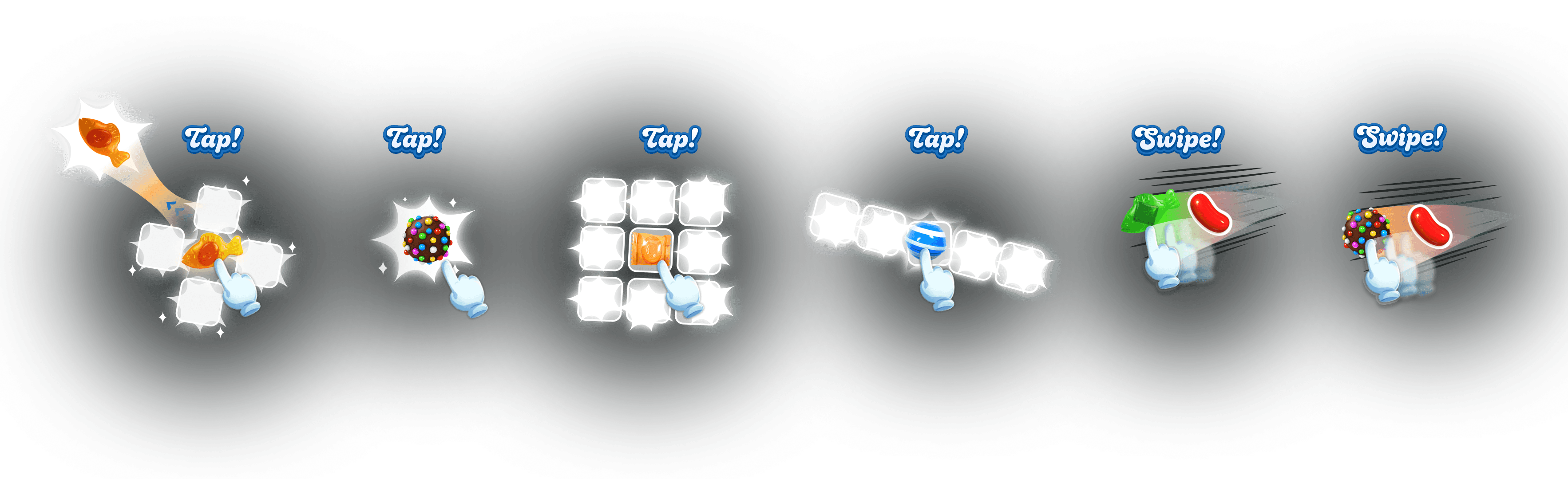
Quantum introduces tap and swipe activation, the first direct control in Candy Crush history.
Specials activate only when matched. No aim, no timing.
Tap to activate, swipe to aim. Player decides.
Mechanic taxonomy
Tap and swipe interactions per special type. New game logic, new strategy.
Every constraint compounds the last.
The challenge wasn't the mechanic. It was changing how hundreds of millions of people play, inside a live economy where difficulty is the biggest proxy for revenue and the teaching tools themselves can move it.
A 12-year-old engine.
Any new system means refactoring fragile, delicate legacy code. Instability comes free.
Difficulty is the revenue dial.
Difficulty tuning is the closest proxy for gross bookings. Move win rates and the economy moves with them.
Quantum indirectly moves difficulty.
Tap and swipe changes how specials get used, which shifts strategy. Difficulty is extremely sensitive to that shift.
Unforgiving scale.
200M+ monthly players, 20M+ daily, ~1M new every day. Comprehension failures compound fast.
Ingrained gameplay habits.
Players have matched specials to set them off for over a decade. Habits that deep don't unlearn from a pop-up.
One system for everyone.
Level 50 and level 15,000, simultaneously.
Teach a new way to play. Move nothing else.
Inject tap and swipe guidance into a live economy where the teaching tool itself can change difficulty. Every method that follows threads that needle.
Design framework · Invisible onboarding
Multi-approach
No single method wins. Layer them.
Lightweight
Never feels like being taught.
Low cognitive burden
One new concept at a time.
Learn by playing
Do it, don't read about it.
Passive learning
Teach in idle moments.
Zero popup doctrine
The game never stops to lecture.
Three methods came from this framework, scored against each other and combined into one funnel. Minimal text and interactive-first tutorials later became King standards.
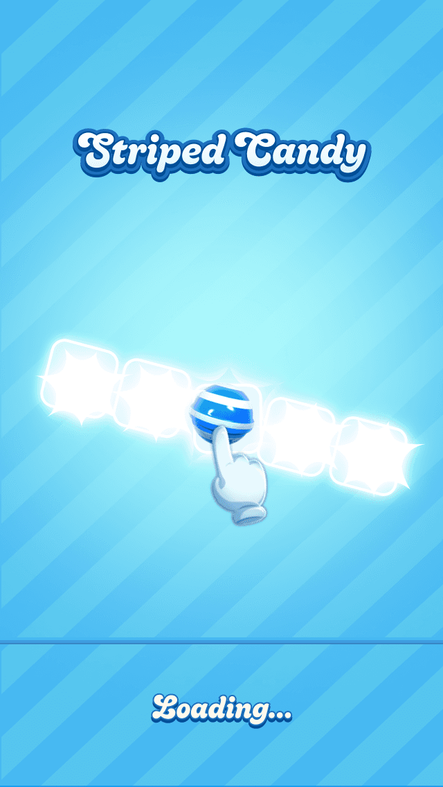
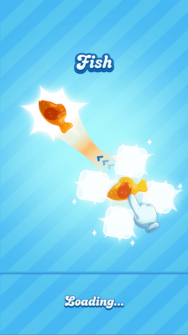
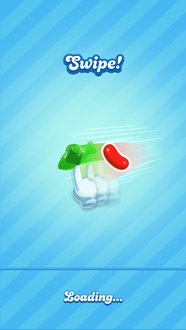
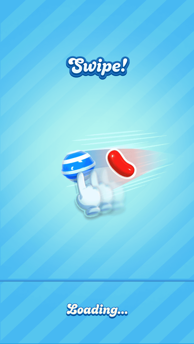
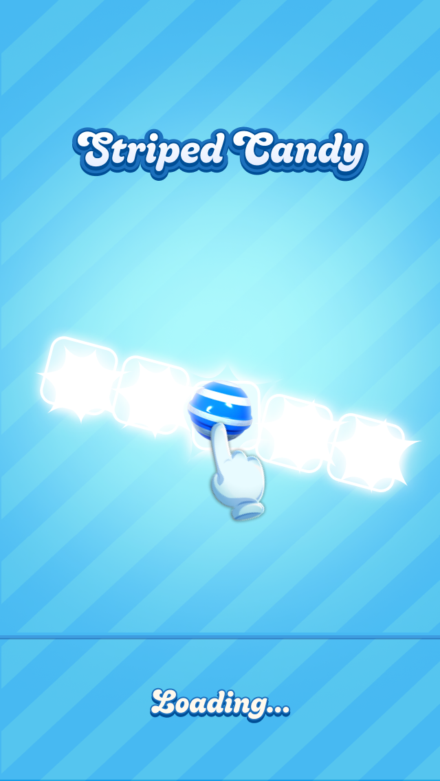
Tutorialized Loading Screens
The first tutorialized loading screens on any King title. Ambient priming before active learning.
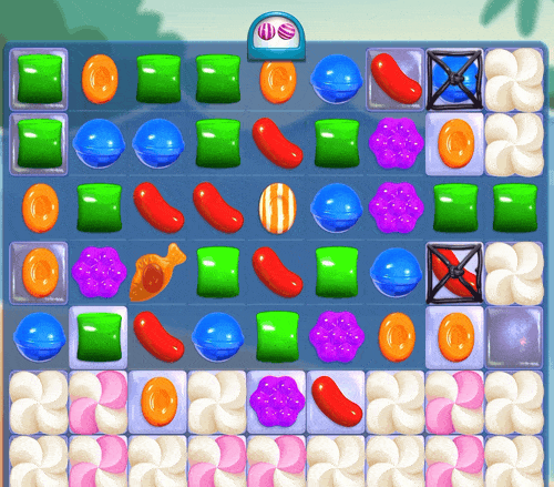
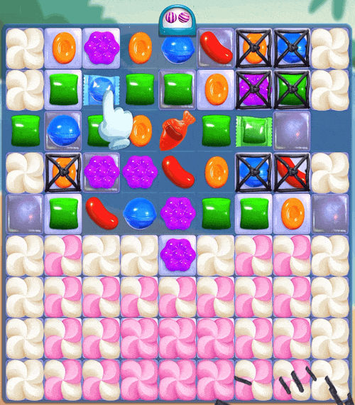
Candy Crush had never used loading screens as a communication surface. I identified this as untapped real estate: a moment where players are already waiting and cognitively available. I designed loading screens that visually demonstrate tap and swipe mechanics, timed to appear before the interactive tutorial and at strategic progression points.
A standard loading screen serving only as a transition with zero instructional value.
Contextual visuals demonstrating the exact tap or swipe interactions required for upcoming mechanics.
Design rationale
Escalating frequency
Increasing frequency over set ranges of levels/episodes.
Repetition & recall
Mandatory viewing at moments of high contextual relevance.
Tailored to the level
Screen selection is driven by intelligence about the upcoming level, surfacing the likely specials, mechanics or interactions a player will encounter.
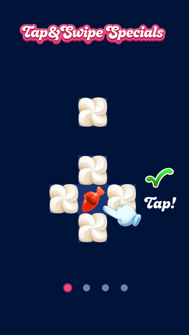
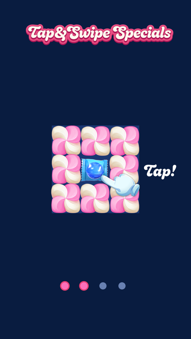
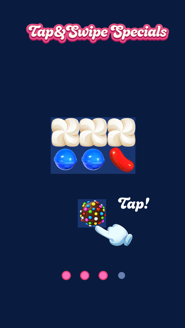
Interactive Sandbox Tutorial
The first at Candy Crush.
3-Step Tutorial
King taught new mechanics with a 3-step text overlay. But for a change this fundamental, reading isn't learning — players had to perform the action, not read about it.
Before — 3-Step Text Overlay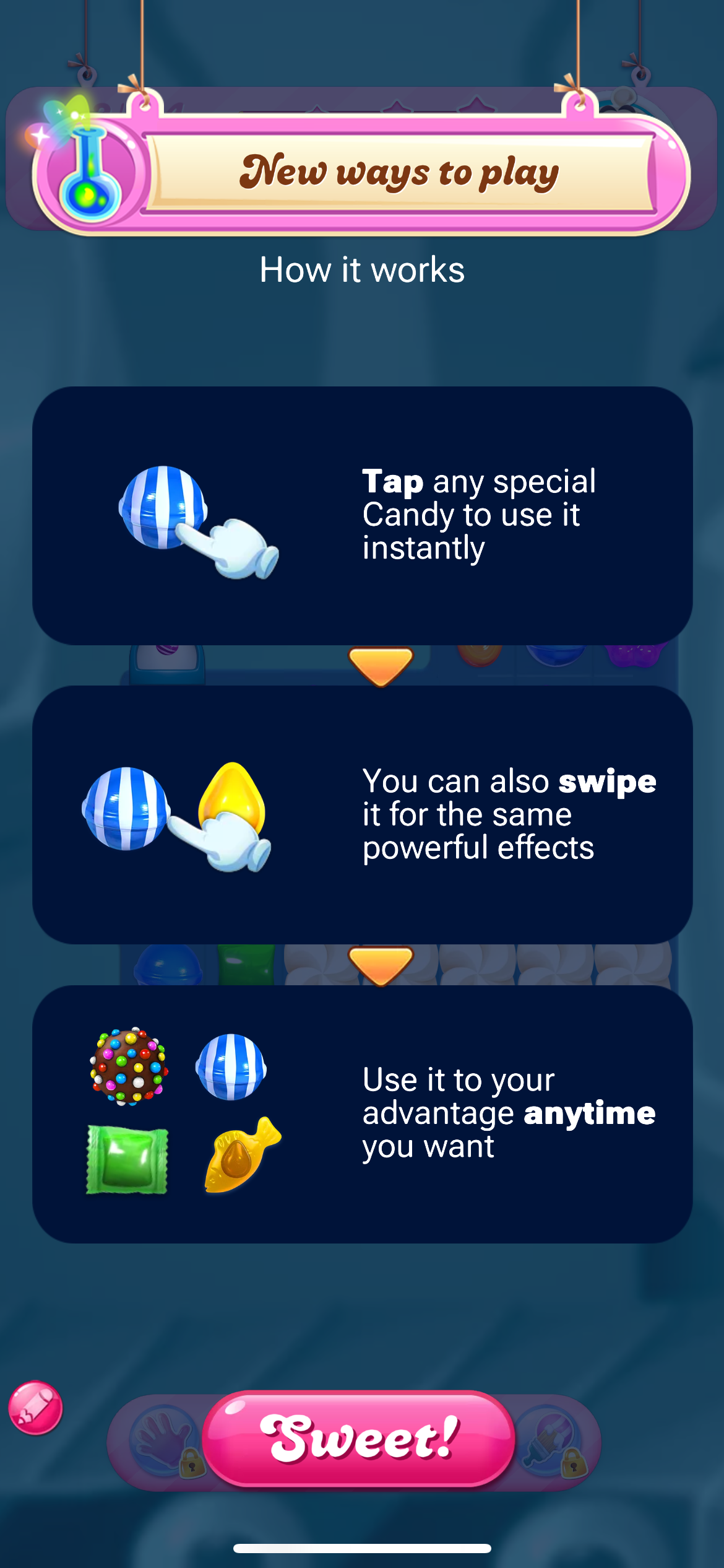
Interactive Sandbox
So I built a playable sandbox: constrained scenarios where the only possible move is the right one. No moves spent, no lives lost — the mechanic teaches itself through play, not text.
After — Interactive Sandbox Concept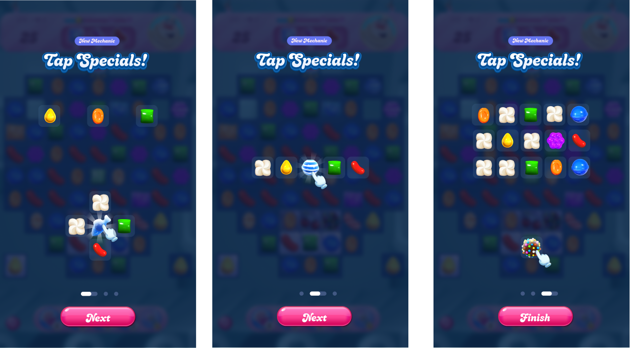
System flow · Hi-fi prototype series
Sequential 5-screen guided interaction flow.
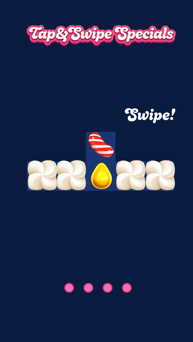
Key decisions
Tap first (simpler), then swipe (directional).
Practice without consequence.
Tapping next / finish on the last page respects veteran players.
The constraint is the instruction.
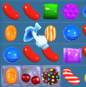
In-Level Guidance (Quantum Hints)
The most delicate piece: teach the interaction through hints without touching what they recommend.
I designed a system that hijacks Candy Crush's existing hint system: when a player has a special on the board but isn't activating it directly, every default hint is replaced with a tap or swipe prompt.
Hints touch difficulty. Difficulty touches revenue. Teach the interaction without solving the board.
Trigger logic
Default hints highlight the best available match. They solve the board for you.
Hijacked hints guide the player to tap or swipe their special. They teach interaction, never strategy.
Hijacking logic
Hijacks all hints for the current level when a special appears.
If onboarding is incomplete at level end, it carries into the next level.
Capped at 3 levels maximum, at clean break points.
Guides the interaction method; never reveals optimal strategy.
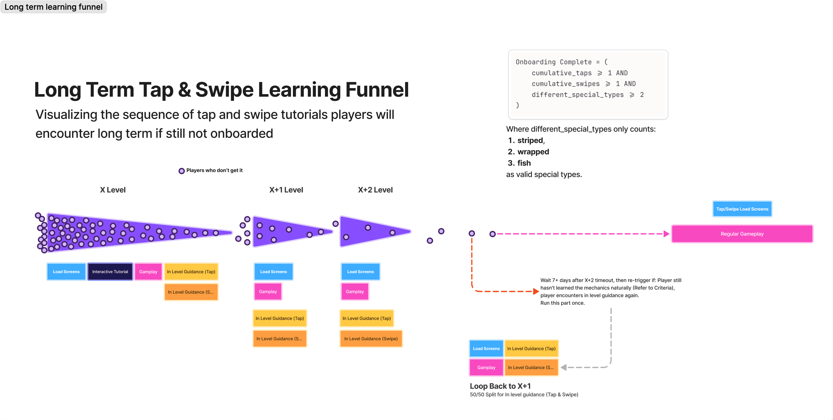
Completion criteria
cumulative_taps ≥ 1 &&
cumulative_swipes ≥ 1 &&
different_special_types ≥ 2
)
Thresholds co-defined with Game Design from behavioral data.
Complementary by Design
No single method covers the whole journey — the system works because each covers what the others can't.
Load Screens
Passive priming, always onInteractive Tutorial
The strong first lessonIn-Level Guidance
Reinforcement in real playEvery method has gaps. Stacked, they leave none — which is why the system ships all three, not the “best” one.
Putting it all together.
The Learning Funnel
Each method is deliberately incomplete on its own. Together, they form a funnel that converts players progressively.
Cohort Attrition Funnel
Visualizing the flow of players through the long term sequence. Each matrix represents a segment of players. As players adopt the tap & swipe mechanics, they exit the forced funnel to regular gameplay.
The full sequence · Detailed map
The complete long-term flow — every path, loop-back, and reactivation branch behind the summary above.
Testing across 8 player cohorts
I authored the research specification and designed a structured 3.5-week Slack-based playtest program with 10 internal testers across 8 cohorts.
Targets · User cohorts
Hypotheses · Key questions
Do players prefer tapping or swiping?
Is the tutorial alone sufficient, or are hints required?
How does speed perception change with direct activation?
Do players notice visual changes to specials?
Engaged King's accessibility team on motor requirements, directional activation with limited dexterity, and VFX readability.
What testers told us
A 3.5-week closed Slack playtest with 10 internal testers. The clearest signal: players switch between tap and swipe strategically, which backed keeping both inputs first-class and tracking dual-input fluency as a success metric.
“Swiping feels more natural — but before I use a special, I check whether it's better strategically to swipe or tap.”
“The ability to now tap gives you extra ways to play more strategically.”
“Really enjoying the new features — I like being able to switch between tapping and swiping.”
How I defined success.
Quantum is in live A/B test and I've left King, so I won't claim results. What I can show is the measurement system I designed: what adoption means, what must not regress, and the thresholds that make the call.
Success · Adoption & comprehension
Guardrails · What must not regress
New Tutorial Standard
The interactive tutorial format was adopted org-wide, replacing the legacy text-based paradigm.
Overwhelmingly Positive Player Feedback
Initial test run with players yielded extremely positive feedback — testers missed the new mechanics once the test ended.
Beta tester feedback
“Swapping is good but tapping is much better! Once you're used to it, going back will not be an option — bring the new features asap.”
“I miss the new mechanics too! Isn't it funny how quickly you get used to something — I'm still tapping!”
“I'm so sad the upgrades went bye bye already — now I keep trying to tap and swipe when it won't let me.”
Design system contributions
Established "minimal text doctrine" as a design principle for future tutorials
Created the first interactive tutorial to break the legacy text-reliant paradigm
Introduced tutorialized loading screens — a first in Candy Crush history
Set a new research methodology precedent with the structured playtest program
What transfers.
The transferable playbook
Never block play
Teach inside the game, not on top of it.
Teach in dead time
Loading screens, transitions, downtime.
Reinforce in context
Hints inside real levels, not lectures.
Guardrails before shipping
Define what must not move.
Tests decide contested calls
Player data, not meetings.
Transfers to any product changing how millions use something they know by heart.
Concurrent workstreams
Replacing legacy boosters with new ones, including inventory conversion and rollback narratives.