Hungry Shark Primal's shop brought together currencies, fossils for unlocking sharks and limited-time bundles. Players needed to understand the value of each offer; the live operations team needed to change promotions without a redesign.
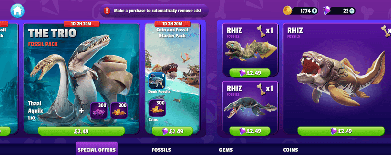
As lead UX designer, I designed the navigation and a system of reusable offer blocks. Standard sizes gave artists a consistent format and let the live ops team combine offers into different layouts.
Testing found no major usability issues, and players responded well to the large offer artwork. Live ops content updates became 40% faster.
Design principles
I drew on my Hungry Shark World shop work and reviews of other mobile games to define six principles. They covered what players needed to understand and what the team needed to control.
- 01Explain what is includedShow the contents of a bundle alongside its price.
- 02Show prices clearlyMake the cost visible before the player enters the purchase flow.
- 03Introduce detail when neededKeep browsing scannable, with more information available when choosing an offer.
- 04Match offers to progressSupport offers relevant to the player's stage in the game.
- 05Support different player groupsAllow bundles to vary with play and purchase behaviour.
- 06Make updates manageableBuild the shop for quick changes and seasonal content updates.
Reusable shop layouts
Offer blocks
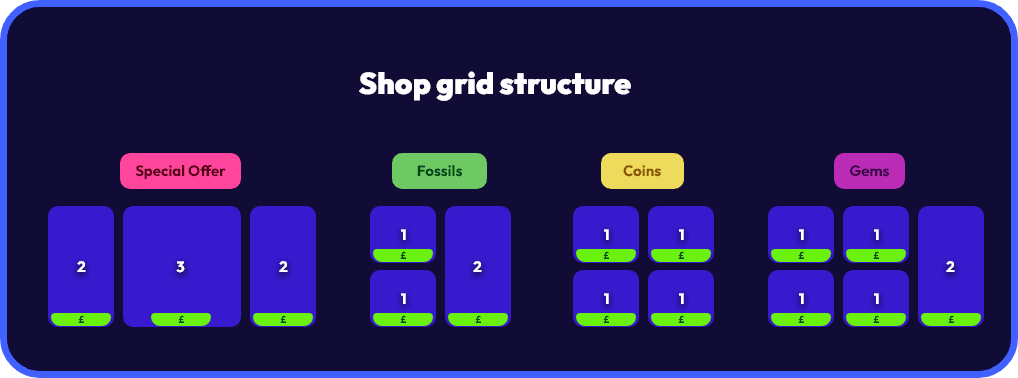
Blocks came in three standard widths. The team could give a featured bundle more space or group smaller offers without changing the overall structure.
Players could scroll horizontally or jump to a category using shortcuts along the bottom. Economy designers and live ops managers could replace offer blocks as campaigns changed.
Large block
Featured bundles with room for artwork and contents.
- Width
- 3 units
- Role
- Featured content
Medium block
Regular promotions and currency packs.
- Width
- 2 units
- Role
- Core sales
Small block
Individual offers and smaller packs.
- Width
- 1 unit
- Role
- Compact offers
Custom offers
Limited-time offers
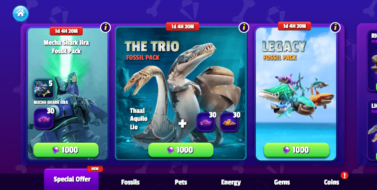
Limited-time promotions used the same blocks, with a countdown alongside the contents and price. They could change size and placement without changing navigation.
Dynamic offer system
The offer system supported promotions for different player groups and stages of progression.
- Player segmentationDifferent bundles for different play and purchase patterns.
- Real-time generationOffers based on the player's current progress.
- A/B testingCompare offer variants across player groups.
- Seasonal eventsScheduled promotions and limited-time offers.
Design evolution
I developed the layout from wireframes into the themed shop screens shown below. The horizontal navigation and offer blocks stayed consistent as artwork and promotional content were added.
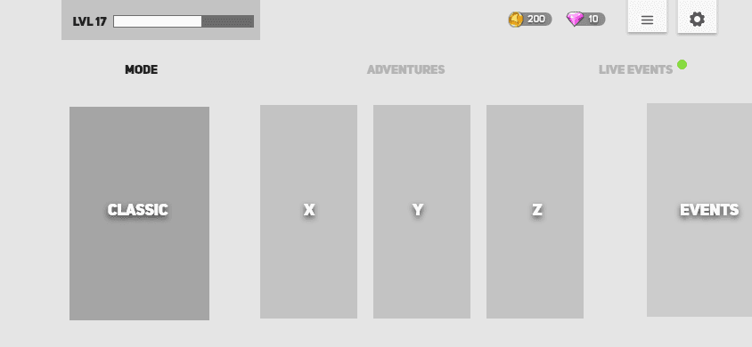
The first wireframe set out the structure in grey boxes: tabs across the top, one large card, then a row of narrower ones.
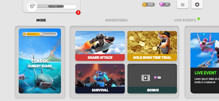
The second pass added artwork and labels to the same layout, with the large card kept on the left.
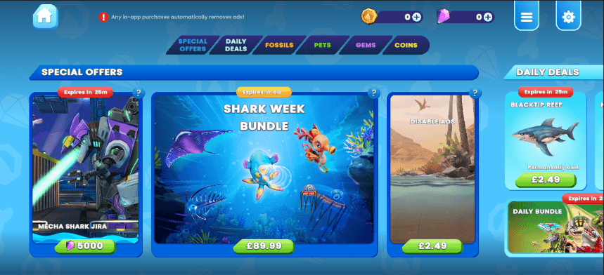
The themed shop grouped offers under headings, with category tabs across the top and a countdown on each limited-time offer.

In the final screens, gem and coin packs fill one- and two-unit blocks, each with its price on a green button.
Results
Players responded well to the large offer artwork, and the live ops team could change routine offers without developer support.
- Major usability issues identified in testing
- Zero
- Faster live ops content updates
- +40%